'It's deja vu all over again'
- Mike D'Andrea ChFC®
- Aug 30, 2019
- 5 min read

8-30-2019
Recent Pullback
Global Asset Rankings
The Yield Curve
If today’s stock market seems to be in strangely familiar territory, it should. In fact, the Standard & Poor’s 500 (a stock index comprised of the largest 500 domestic stocks) was standing on this very same ground nearly 21 months ago. As we can see, U.S. stocks have had difficulty staying above the 2,900 range on the S&P500. While sideways price activity in a major index is nothing new or alarming, there is a growing notion that the end is near for this bull market. Let’s take a peek at what the numbers are saying and take a deeper look at one market metric that is getting a lot of attention these days.

Recent Pullback
Let’s begin by looking at where U.S. stocks are today in relation to the last market high. This chart, courtesy of Doug Short, really provides a great visual reminder that 5% to 10% corrections are a very normal occurrence. We should expect to see them a few times each year.

Since 2009 there have been 17 such corrections of between 5% and 10%, and another 8 going from 10% to almost 20%. Each correction came with its own series of negative press and painful headlines. Today’s correction is no different. Between trade wars, yield curves and another election nearly 434 days away, the financial press has all the ammunition it needs to go full on mad once again.
Global Asset Rankings
The antidote to this mad condition are the facts in hand. To gain some perspective on what the numbers have to say, let’s take a bird’s eye view of the markets via our broad global rankings. Domestic Equities continue to rank in first position have been holding that spot for a few years now.

Domestic equities and Fixed income are highlighted as they represent most positions across our models.
Taking a more granular view of the global rankings, (breaking down each individual area) we still see that U.S. Stocks are in a very strong posture relative to other investments. Ideally, we want to see Cash ranking below 40% consistently and U.S. Core Stocks ranking above 60% consistently. It is plain to see that both figures are currently in good position with cash sitting at 15% and U.S. Core Equity at 90%.

There are very few areas ranking higher than U.S. Core Equity, but you may be surprised to find U.S. Long Bonds, Utilities and even Russia (no tampering, I promise… it’s just math) ranking higher. Surprising areas ranking lower than Cash today are European stocks, US. Value Stocks, and our trade war foe, China.
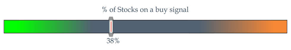
As nice as the relative rankings looks, all is still not right with the world. There have been significant periods of weakness in U.S. stocks over the last 21 months and today there now are more stocks in the New York Stock Exchange on a Sell signal than Buy signal. This puts us in a state of heightened alert, but with the above rankings in tack these periods of pullback have a high probability of working themselves out to the upside. As always, though, we need to stay open to all possible outcomes.
The Yield Curve
Now, let’s narrow the perspective a bit and focus on the yield curve for a moment. The yield curve is simply the shape that is created when you plot the interest rates of various government bond yields on a chart and connect them with a line. For example, today’s curve is comprised of the following rates arranged in the following manner:

The shape or relationship of the rates to each other is very important. The curve can basically do three things. It can be positive (slope upward), it can be flat, or it can be inverted (slope downward). The implication of each is outlined as follows:

Interest rates are important and bank’s willingness to lend can be a significant factor in the health of the economy. When it comes to forecasting recession and making investment allocation decisions, there is much more to the story than just the yield curve. Don’t get me wrong, the yield curve is a relevant metric. But every indicator needs context and confirmation to be valuable.
We have typically seen recessions after the yield curve has remained inverted for a sustained period of time. (in today’s case, the curve inverted for two days before returning to flat for the 2yr and 10yr on the 30th of August) And even then, we have not typically entered a recession for 9 to 18 months after the yield curve inverted, with the US equities market typically advancing in the interim.
As you can see in the chart below, which shows the spread between the 10-year and two-year US Treasuries since 1977, there have been periods where the yield curve briefly inverted and then returned to normal. For example, the curve was inverted in June and July of 1998, but returned to normal by August, which was more than two and half years before the next recession which began in March 2001. The curve also briefly inverted in December 2005, which was two years prior to the most recent recession which began in December 2007. It is also worth noting that the data below relies on closing prices and does not show inversions that reverse intraday.

Seeking even more context, others have argued that, more than any single relationship being inverted (i.e 2yr and 10yr yields), the overall level of inversion across the yield curve is a more reliable indicator. Intuitively this makes sense – as we have stated, it is typically prudent not to rely too heavily on any one data point. Relying on additional data points seems especially advisable now, as many economists have argued that the Fed’s quantitative easing program has put downward pressure on longer-term yields, altering the “natural” state of the yield curve, and inducing inversions that would not have occurred otherwise.
As the graphic from Scotiabank below shows, since the late 1960s we have generally seen 80%, 90%, or even 100% of the yield curve become inverted ahead of a recession. The red dotted line meeting the green line represents that 100% inversion condition.

So, to summarize, yes, we have often seen inversion of the two-year and 10-year US Treasury yields ahead of recessions. However:
Recessions have typically only come after an extended period of inversion and even then, they have typically been 9 – 18 months away.
How long the two-ten spread stays inverted will shed light on the probability of recession.
Looking at the overall level of inversion across the yield curve may be a better metric, especially given the effect that quantitative easing has had on longer-term bond yields.
The portion of the yield curve that is inverted remains well below that of the levels seen ahead of previous recessions.
Should you have additional questions or concerns, please feel free to reach out or reply.
Chat soon,
Mike D’Andrea, ChFC®
Founder // D’Andrea Financial

Comments